
How a Scandinavian Color Palette Transforms Your Space
Scandinavian design has long been admired for its simplicity, functionality, and natural beauty. At the heart of this design style is the careful selection of colors—a palette that brings harmony and a sense of calm to any space. While Scandinavian interiors are often associated with clean lines and minimalism, it’s the thoughtful use of color that truly elevates this style, making it feel warm, inviting, and timeless.
What Defines a Scandinavian Color Palette?
The typical Scandinavian color palette is inspired by the natural environment of the Nordic region, which experiences long, dark winters. As a result, these colors are chosen to maximize light, create a sense of space, and evoke the tranquility of nature. Here are the key characteristics that define this palette:
1. Neutral Tones as the Foundation
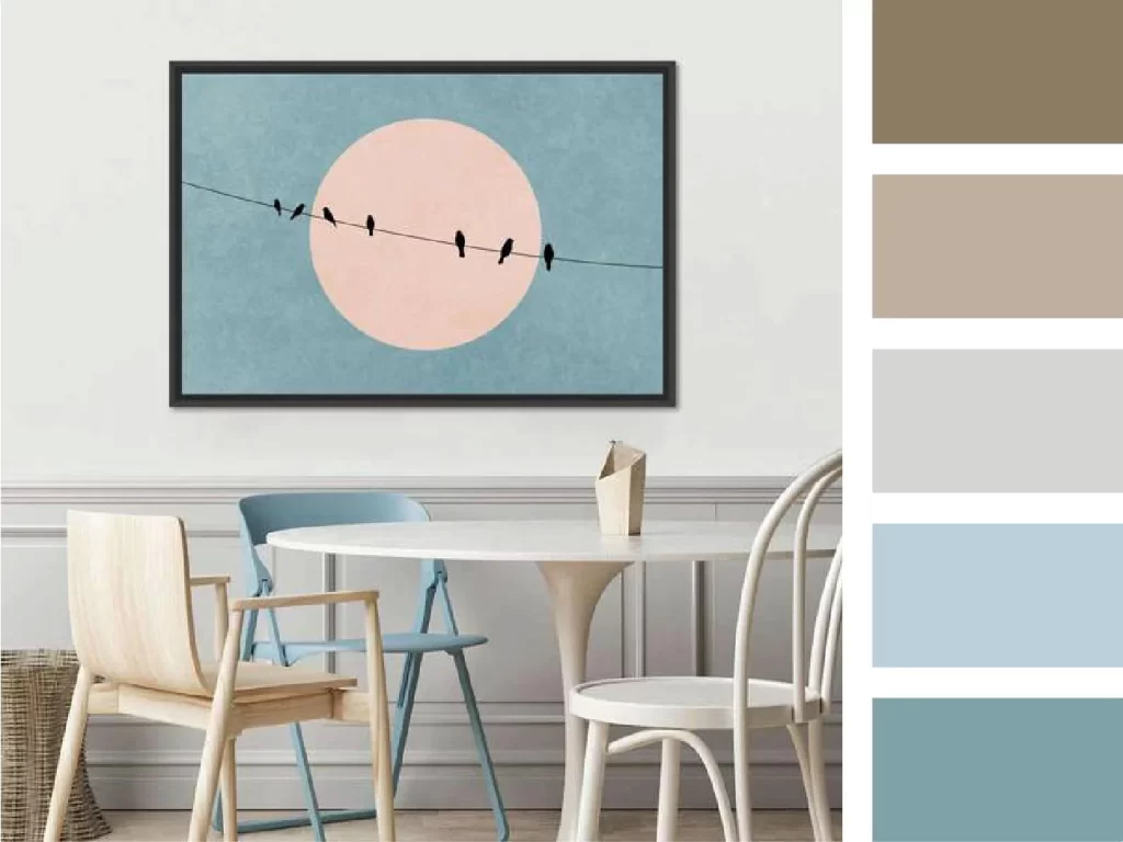
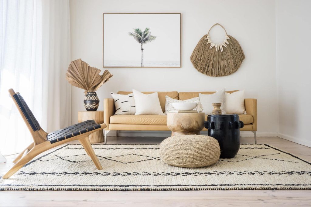
A Scandinavian palette often starts with neutral colors like white, beige, or light gray. These soft hues form the backdrop of the space, reflecting natural light and creating an airy, open atmosphere. Neutral walls, for instance, act as a blank canvas that allows the other design elements to stand out without overwhelming the room.
2. Warm Earthy Hues
Scandinavian design incorporates warm, earthy colors such as soft browns, terracottas, and muted taupes to counterbalance the cool, neutral tones. These hues add warmth and comfort to the space, evoking a sense of coziness, especially in living areas or bedrooms. Like oak and birch, light woods often complement these colors, bringing a natural and organic feel to the room.
3. Cool Shades of Blue and Green
Scandinavian design often integrates soft blues, dusty greens, and cool grays that evoke the natural landscapes of the Nordic countries—forests, lakes, and skies. These colors add a subtle vibrancy to the space without overpowering the minimalist aesthetic. These tones can create a serene and balanced look when used thoughtfully in textiles, furniture, or accents.

“In Scandinavian design, the colors of nature—earth, sea, and sky—are brought indoors to create spaces that are calm, harmonious, and deeply connected to the environment.”
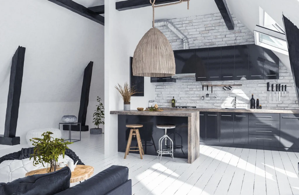
4. Dark Accents for Contrast
While Scandinavian design is generally light and airy, it’s not uncommon to introduce darker shades like charcoal, navy, or even black as accent colors. These darker tones are often used sparingly to create depth and contrast, whether in furniture legs, light fixtures, or decorative accessories. They ground the design and add a touch of modern sophistication, ensuring the space doesn’t feel too monotone or bland.
Minimalism with Warmth
One of the challenges of minimalism is that it can sometimes feel cold or impersonal. However, Scandinavian design masters the art of minimalism with warmth by using these balanced color palettes. The combination of soft neutrals, warm woods, and cool hues ensures that spaces remain inviting while maintaining a clean and clutter-free look.
The key is restraint—using just enough color to create a mood but not so much that it disrupts the simplicity. Whether you’re designing a living room, kitchen, or bedroom, a Scandinavian color palette helps achieve that perfect balance of minimalism and warmth.
The Connection to Nature
A hallmark of Scandinavian design is its connection to nature, not only through natural materials but also through the use of nature-inspired colors. Whether it’s the gentle blues that mimic the sea, the greens that echo the forest, or the soft earth tones of the soil and wood, this palette brings the calming essence of the outdoors inside.
By choosing colors that reflect the natural world, Scandinavian interiors feel restful and grounded. This makes them perfect for creating a peaceful retreat, whether you live in a bustling city or a quiet rural area.
How to Use a Scandinavian Color Palette in Your Home
1. Start with a Neutral Base: Opt for white, light gray, or beige walls to create a bright and open foundation. These colors reflect light and make the room feel larger, which is especially important in smaller spaces or during winter months.
2. Incorporate Natural Woods: Scandinavian interiors often use light woods such as oak, pine, or birch to add warmth and texture. Whether it’s in furniture, flooring, or even small accents, natural wood tones are essential to achieving that cozy, grounded feel.
3. Add Layers with Cool and Warm Tones: Layer your neutral base with soft blues, greens, or warm terracottas. Use these colors in your textiles, like rugs, cushions, or curtains, or in your furniture choices. These tones add dimension and prevent the space from feeling sterile.
4. Introduce Darker Accents: Don’t be afraid to use darker colors like black, charcoal, or navy as accents. These can be introduced through small furniture pieces, lighting fixtures, or decorative elements. The contrast will provide depth and balance to the otherwise light palette.
Conclusion
A Scandinavian color palette is much more than a simple collection of neutral tones. It’s a thoughtful blend of nature-inspired colors that work together to create a space that feels both calming and welcoming. Whether you’re redecorating an entire home or just refreshing a single room, embracing these colors will help you achieve that effortless Scandinavian look—one that combines functionality, warmth, and beauty in perfect harmony.